|
|
Post by Robman on Sept 30, 2016 18:38:43 GMT -5
How did you pull off the lighting effect by the light? It looks like you used a triangular lighting sprite, but I havn't found any. Sadly Shadow Warrior doesn't have a triangular lighting sprite like that, Blood and Duke does... I always felt(or grew to feel) a bit limited when it came to SW's texture selection, so I've added most of the duke art, some blood and some RR to my art files that will be used in the new add-on. And now I have a quite large selection of textures to choose from, it's kinda fun. The lighting effect on the ground was done with 2 of the square lighting sprites that SW has, same sprite just put back to back, given the palatte colour of 13 and some translucency. |
|
|
|
Post by Ninjakitty on Sept 30, 2016 18:54:55 GMT -5
I loaded up my map and all of the sprites and some of the sectors were not positioned on the grid intersections like they were when I saved the map. This is a problem.
*Edit: I fixed it.
|
|
|
|
Post by Robman on Sept 30, 2016 19:07:31 GMT -5
Hmmm.. did you move a whole bunch of selected sectors by accident or something? Can't say I've had that happen. There is a back up file of the map though right? .bak or whatever.
|
|
|
|
Post by Ninjakitty on Oct 1, 2016 17:09:12 GMT -5
Nope, it just happened. The only problem with it is that any new sprites I would've added in would not line up with some of the pre-existing sprites and sectors. Even on the smallest grid size, some of the sprites and sectors didn't line up. It only happened to the most recently added part of the map and I was able to fix it by shift-selecting everything and dragging everything back into place.
|
|
|
|
Post by Robman on Oct 2, 2016 2:09:59 GMT -5
|
|
Manhs
New Member
Posts: 48 
|
Post by Manhs on Oct 2, 2016 2:57:16 GMT -5
Like i said on the video, im very hyped for SW2 gameplay style (more vertical with hubs, should be not more mazed). But im hyped with your expansion too ! I have finished everything and a lot of expansions, even 60% of the "playable" user maps for Single Player.... (in "No Pain No Gain" 1 life per map). I need more Lo Wang Battles!  Good luck with it !  |
|
|
|
Post by Robman on Oct 3, 2016 3:36:34 GMT -5
There will be more Lo Wang Battles to be had in the future, I promise  Made another apartment room tonight, here's a shot of the fridge, has a cookie in it and the door opens/closes. This apartment is occupied by vagrants, a crate to sit on and booze bottles all over the place, they do have a giant screen tv and game system though, lol. Stronger shading in this one also. 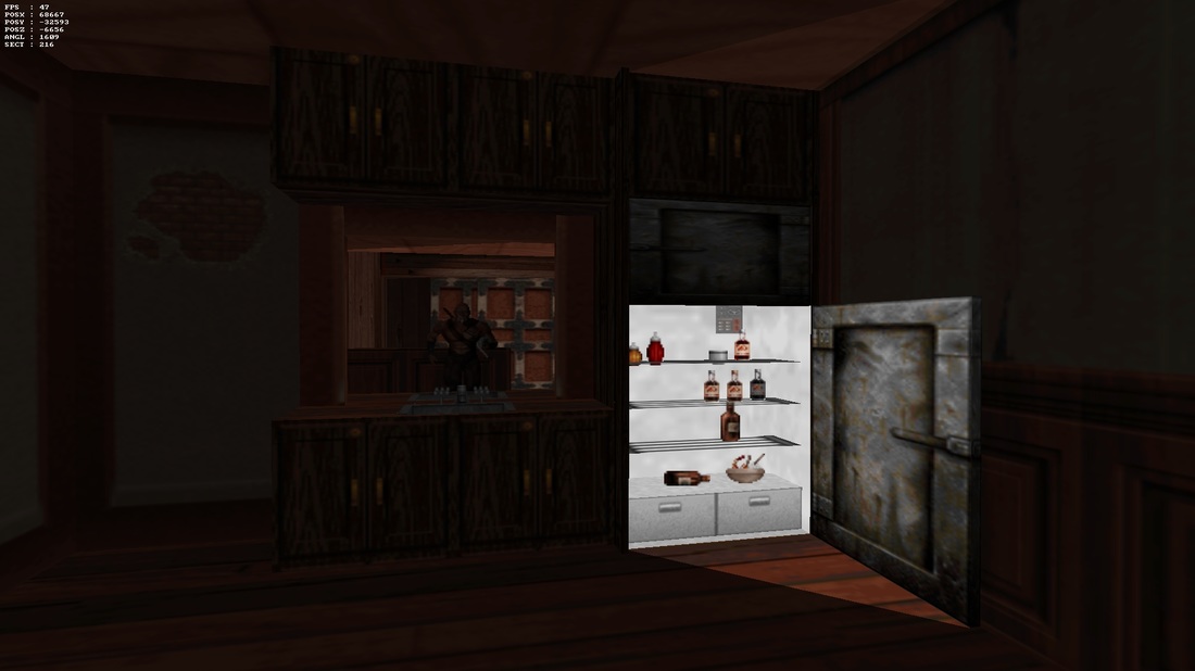 |
|
|
|
Post by Ninjakitty on Oct 3, 2016 15:06:30 GMT -5
Whoa! I'm just now realizing how few textures Shadow Warrior has, I don't think most of the textures there are in SW.
|
|
|
|
Post by Robman on Oct 3, 2016 15:12:31 GMT -5
Whoa! I'm just now realizing how few textures Shadow Warrior has, I don't think most of the textures there are in SW. Yep, hence the beauty of making your own add-on. You get to use extra art files, .def file mods, sounds etc.. If you're making just single maps, it's best to just stick to the stock artwork and such so that when you distribute your map, it's just the map.. not the map+ a bunch of files that clutter things up and have a chance of getting misplaced. |
|
|
|
Post by Ninjakitty on Oct 3, 2016 15:22:31 GMT -5
Whoa! I'm just now realizing how few textures Shadow Warrior has, I don't think most of the textures there are in SW. Yep, hence the beauty of making your own add-on. You get to use extra art files, .def file mods, sounds etc.. If you're making just single maps, it's best to just stick to the stock artwork and such so that when you distribute your map, it's just the map.. not the map+ a bunch of files that clutter things up and have a chance of getting misplaced. That's exactly why I haven't already added in my own textures. I also would have a hard time finding textures to add in that actually fit SW's theme. |
|
|
|
Post by Robman on Oct 18, 2016 2:14:06 GMT -5
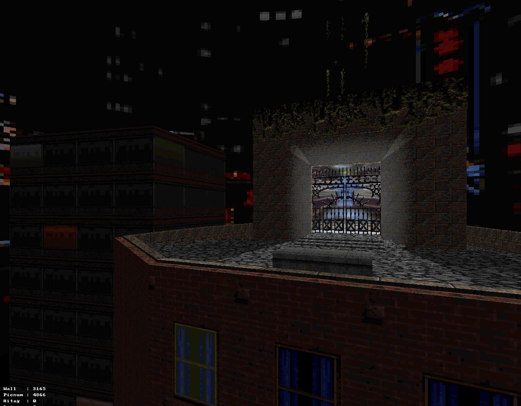 Hmm, where'd I get the image behind the gates? ... what is it? |
|
|
|
Post by Ninjakitty on Oct 18, 2016 15:37:22 GMT -5
It almost looks familiar... Probably only because I can't see much of it. Gbscene is a little less than descriptive and my internet browser won't let me zoom in without blurring it. Pixelizing is better.
I'm clueless.
|
|
|
|
Post by Robman on Oct 18, 2016 16:35:36 GMT -5
What if GBscene meant Ghostbusters scene?
|
|
|
|
Post by Ninjakitty on Oct 18, 2016 17:53:13 GMT -5
Oh! I knew it looked somewhat familiar. So, you're adding some Halloween styled stuff to your maps? Maybe you should try to sneak in a jumpscare. I did something similar to a jumpscare in the mines of my warehouse map.
|
|
|
|
Post by Robman on Oct 18, 2016 19:24:50 GMT -5
What's your version of a jumpscare?
|
|
|
|
Post by Ninjakitty on Oct 18, 2016 19:31:39 GMT -5
Not really a "Jumpscare". There would be dead rippers in a cage and as soon as the player walked away, I played their death animation backwards(using a LOT of sect_copies and vators) and then spawned in living rippers and had the cage door slide open. It's not really that much like a jump scare but I still think it looks cool.
|
|
